The blog Graphic Sociology, part of the Contexts community of
blogs, provides an excellent forum for discussing the
visual presentation of information. The blog's author, Flaneuse(a.k.a., Laura Noren), provides examples of the good, the
bad, and the ugly in data visualization with a narrative of
"what works" and "what needs work" for each graphic.
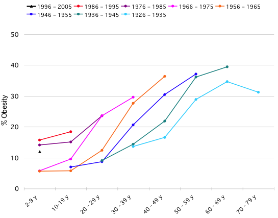
Yesterday, Flaneuse had a post on obesity trends that originated at the blog Flowing Data. Nathan Yau, the author of Flowing Data posted a challenge to his readers to make an image that answers the question are people getting fatter faster?1 that improves on the following one:

Despite ...
