posts in population health

Sometimes art expresses truth better than research ever could. I present the following as evidence of art capturing the essence of the Whole Foods habitus.

The video is of course meant to parody the cultural conventions of Whole Foods; but, I think that it really speaks to larger truths about culture, food, and inequality. While the video pokes fun at the Whole Foods consumer, I think that it accurately reflects how out of touch a vast swath of relatively privileged Americans are regarding the real struggles of poorer and many minority residents face when attempting to eat a healthy diet. Forget the fact that kombucha isn't on the shelves, many ...
Last night on the Daily Show, Jon Stewart interviewed National Geographic Explorer-in-Residence Spencer Wells about his new book, Pandora's Seed. About half-way into the interview (3:55, to be exact), Stewart asks a great question:

But isn't our obesity almost a medal, a badge of sorts, congratulating us on our...utter domination of the planet?

I'm not sure how well obesity-as-badge-of-honor will get anyone, but to a large degree it is true and example of what demographers call the demographic transition. Rather than dying of infectious diseases that left the human population with relatively high death rates, we now find that disease in developed nations is largely due to ...

This weekend, one of my favorite academic-flavored blogs on the internet shuttered its doors. Effect Measure was a blog about public health and public health policy. The authors, who collectively wrote under the pseudonym "revere" in recognition of Paul Revere's service on the first local Board of Health in the U.S., are expert epidemiologists that brought detailed technical expertise to issues of public health along with a broad knowledge of public health policy and its role on American health. Although I read their blog regularly, their daily -- indeed, sometimes hourly -- analysis of the swine flu outbreak were indispensable and made it a daily read during and after the ...

The blog Graphic Sociology, part of the Contexts community of blogs, provides an excellent forum for discussing the visual presentation of information. The blog's author, Flaneuse(a.k.a., Laura Noren), provides examples of the good, the bad, and the ugly in data visualization with a narrative of "what works" and "what needs work" for each graphic.

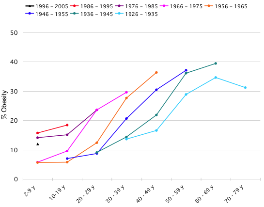
Yesterday, Flaneuse had a post on obesity trends that originated at the blog Flowing Data. Nathan Yau, the author of Flowing Data posted a challenge to his readers to make an image that answers the question are people getting fatter faster?1 that improves on the following one:

Flowing Data Obesity Trends

Despite ...