posts tagged “data-visualization”

On Twitter, Phil Cohen asked how he might make a plot showing overlapping distributions:

I think that he was on the right track using transparency, but I am not sure that the color was exactly right. The plot reminded me of what Mike Bostock (my generation's Edward Tufte) did to make a population pyramid.

Phil was also working with another disadvantage: he's using Microsoft Excel. Excel (all Microsoft Office products actually), renders the alpha channel terribly ...
My friend and colleague, Danny Sheehan was interviewed on WNYC's Brian Lehrer Show this week talking a map he designed that tracked the flow of residential mobility among Brian Lehrer listeners. Among 1,600 entries, his was selected as one of the 15 featured, and one of two people interviewed about his design on-air live. You can see a video his map here.

Since my research is about where people move, this is obviously more than of just passing interest to me and Danny's visualization of moves is an incredibly helpful tool to detect patterns of neighborhood change. I know this because Danny helped us with a project that ...

The blog Graphic Sociology, part of the Contexts community of blogs, provides an excellent forum for discussing the visual presentation of information. The blog's author, Flaneuse(a.k.a., Laura Noren), provides examples of the good, the bad, and the ugly in data visualization with a narrative of "what works" and "what needs work" for each graphic.

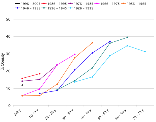
Yesterday, Flaneuse had a post on obesity trends that originated at the blog Flowing Data. Nathan Yau, the author of Flowing Data posted a challenge to his readers to make an image that answers the question are people getting fatter faster?1 that improves on the following one:

Flowing Data Obesity Trends

Despite ...