The blog Graphic Sociology, part of the Contexts community of
blogs, provides an excellent forum for discussing the
visual presentation of information. The blog's author, Flaneuse(a.k.a., Laura Noren), provides examples of the good, the
bad, and the ugly in data visualization with a narrative of
"what works" and "what needs work" for each graphic.
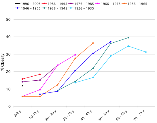
Yesterday, Flaneuse had a post on obesity trends that originated at the blog Flowing Data. Nathan Yau, the author of Flowing Data posted a challenge to his readers to make an image that answers the question are people getting fatter faster?1 that improves on the following one:

Despite the solutions posted at Flowing Data, I actually think that the original graph is not a bad representation of the data; however, it suffers from a few technical problems that I think would be easy to solve. First, the graph does not indicate that the lines are birth cohorts (though Nathan's text does indicate that is what the lines represent). Second, given that they are successive birth cohorts in the study, I think that the colors could have been used more creatively to indicate that they are successive (i.e., the oldest cohort could have been rendered in light gray and the youngest in dark gray with appropriate scaling in between). There are two reasons that I like this graph better than many of the alternatives. First, it follows people over time, which makes a narrative easier to figure out from the image. Second, because what we are interested in is the change in slope of the percent obese across successive cohorts, the original image displays this very well.
Flaneuse suggested the solution (click link to view) of Jonas Sekamane as an improvement. The first take simply showed a guideline across age groups, which did little to help clarify whether people are getting heavier across time and doesn't offer much clarity. His second attempt, however, is a quite elegant solution. The one shortcoming that it has is that it is not obvious that the same people are measured at all. One potential fix for the example graphic is to make all of the bars in the same column (rather than row) the same color. I think that would visually drive home the fact that those are the same people and make it obvious that adjacent bars are comparing the same two groups of people at equivalent times in their life (the bar to the left of a given bar is the cohort immediately older of the given bar while the bar to the right is the cohort immediately younger). Also, the bottom axis should be labeled "year of birth," which would also help the interpretability of the graphic. Additionally, one could consider displaying the line and bar graphs side-by-side, especially if the line colors representing cohorts in the line graph corresponded to the bar colors of cohorts in the bar graph. Then, it would be, I think, easy to see how the two pieces of information corresponded.

In the end, I think that it is a clever graphic that really
drives home the point of demonstrating what is happening across
successive age groups (or of age-period-cohort analysis more
generally).
-
I don't agree with the phrasing "getting fatter," but that's what he wrote. ↩

Comments
Comments are closed.